Peptide ad examples. With the thinking behind them.
Good creative starts with a clear angle. Explore 24 original concepts and see what each one is designed to communicate, who it speaks to and what to test next.
24 original concepts3 product contextsAngles, hypotheses and test ideas
These are illustrative concepts for a fictional brand, Apex Peptides. They are not live campaign results or evidence of Meta approval. Research compounds, finished cosmetics and nutrition products are distinct categories; the product and destination must be eligible for the intended placement.
The creative collection
Find the angle. Understand the test.
Explore 24 original concepts. Open any brief to see the creative idea, the next variation and a useful measurement.
24 of 24 creative concepts
SkincareConcept 01
GHK-Cu
Skincare
Women · Beauty shoppers
Read the creative brief +
Creative idea
A recognisable skincare ritual gives the serum a place in everyday life. The face and bottle share the frame, so the product stays part of the story.
What to test
Keep the headline and offer fixed; compare this person-led composition with an ingredient-led product close-up.
What to measure
Product-page visits and purchase conversion
Format
4:5 static concept · English
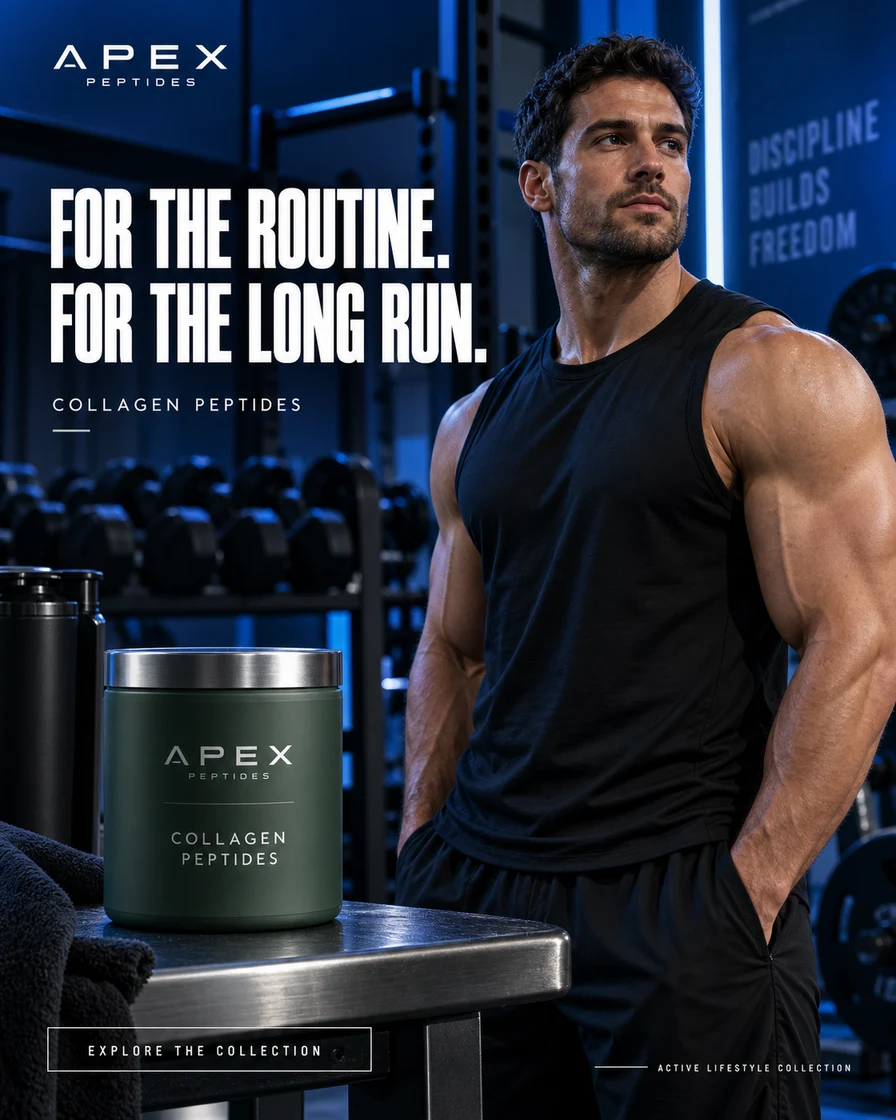
NutritionConcept 02
Collagen Peptides
Fitness
Men · Active lifestyles
Read the creative brief +
Creative idea
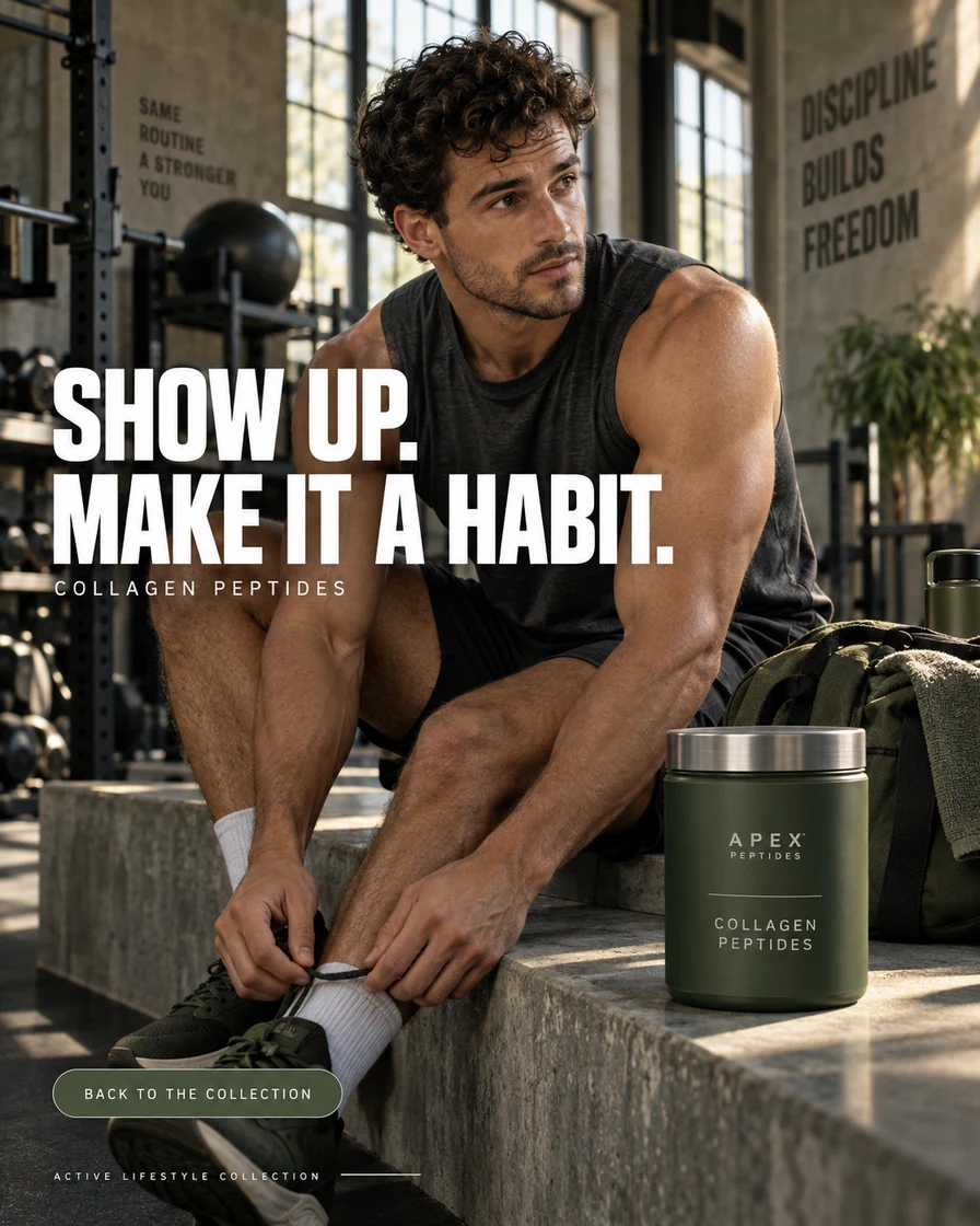
The gym setting introduces an active routine without a body-transformation promise. A clearly visible nutrition tub makes the category easy to recognise.
What to test
Compare an indoor training setting with an outdoor routine using the same product, copy and destination.
What to measure
Landing-page views and cost per purchase
Format
4:5 static concept · English
ResearchConcept 03
Retatrutide
Product discovery
New catalog visitors
Read the creative brief +
Creative idea
High-contrast green and a single vial create a clear catalog focal point. The headline introduces a research topic rather than a personal health outcome.
What to test
For an eligible placement, compare this high-contrast treatment with a neutral catalog visual.
What to measure
Qualified catalog visits
Format
4:5 static concept · English
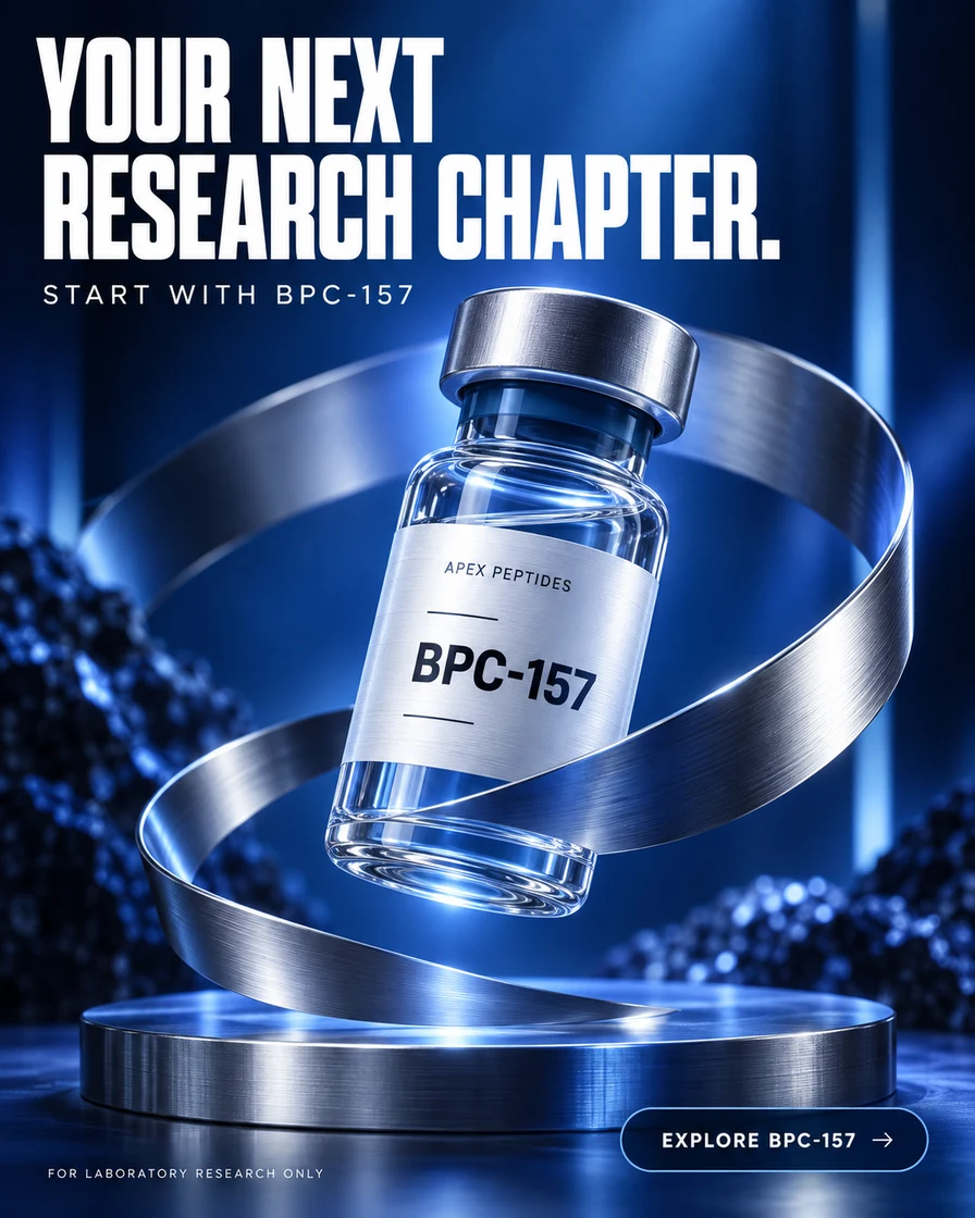
ResearchConcept 04
BPC-157
Product spotlight
Compound-aware shoppers
Read the creative brief +
Creative idea
A large, readable compound name helps an already informed catalog visitor identify the item. The metallic ribbon provides visual movement around the vial.
What to test
Compare compound-name prominence with collection-name prominence while keeping the destination identical.
What to measure
Product-detail engagement
Format
4:5 static concept · English
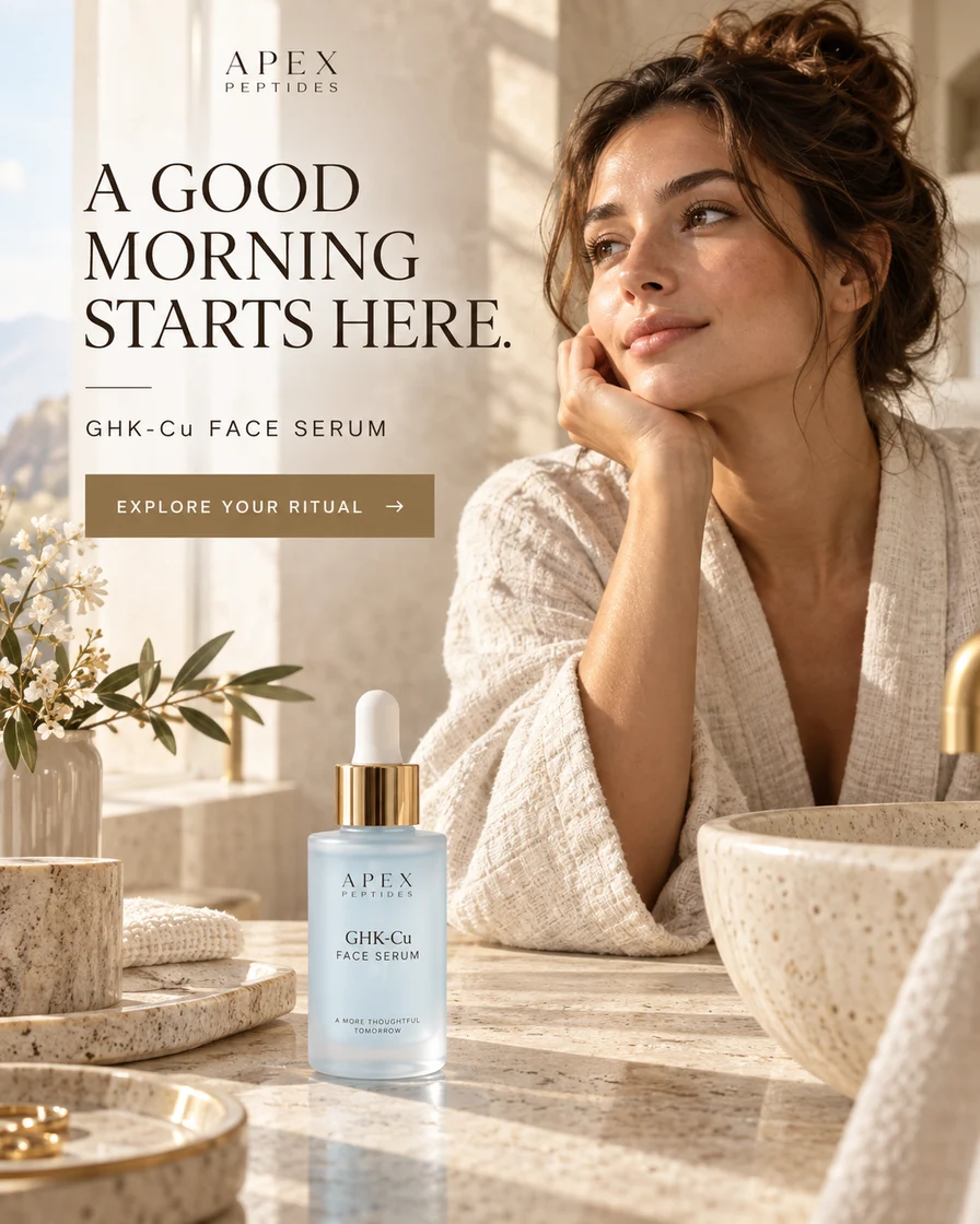
SkincareConcept 05
GHK-Cu
Morning ritual
Women · Skincare routines
Read the creative brief +
Creative idea
Warm morning light makes a familiar moment the entry point. The message is about a skincare routine, with the serum visible beside the person.
What to test
Compare morning context with a clean product-only scene; keep the same ritual headline.
What to measure
Click-through rate and downstream purchases
Format
4:5 static concept · English
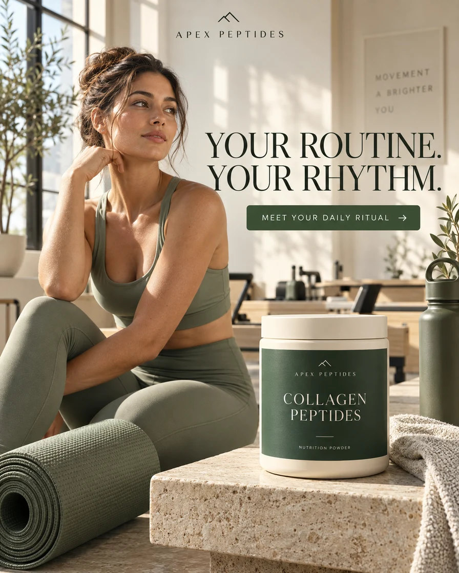
NutritionConcept 06
Collagen Peptides
Active routines
Women · Pilates & movement
Read the creative brief +
Creative idea
A movement-led setting gives a nutrition product a distinct creative context. The routine is the story, without assigning a health condition to the viewer.
What to test
Compare this movement setting with a breakfast setting for the same nutrition offer.
What to measure
Cost per landing-page view and purchase rate
Format
4:5 static concept · English
ResearchConcept 07
Retatrutide
A fresh perspective
Research catalog visitors
Read the creative brief +
Creative idea
Ruby tones provide a visual alternative to the usual laboratory palette. The creative keeps the compound and catalog-discovery message central.
What to test
Hold the copy and vial size constant; compare a warm palette with a cool one.
What to measure
Catalog click-through rate
Format
4:5 static concept · English
ResearchConcept 08
TB-500
Compound discovery
Research teams
Read the creative brief +
Creative idea
A cool, structured backdrop frames a single research item. The restrained composition leaves room for a short headline and a clear collection link.
What to test
Compare a single-item visual with a collection overview for visitors exploring the catalog.
What to measure
Engaged catalog sessions
Format
4:5 static concept · English
ResearchConcept 09
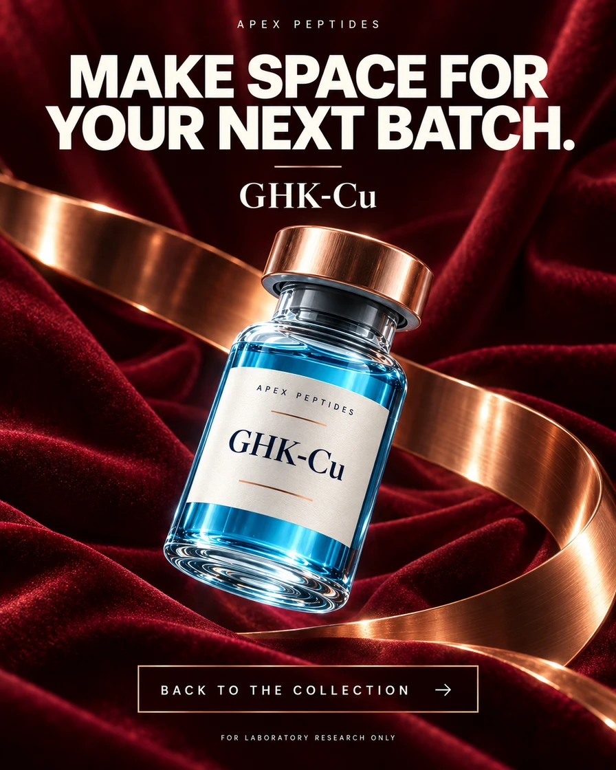
GHK-Cu
Next-batch shopping
Returning catalog shoppers
Read the creative brief +
Creative idea
The next-batch message addresses product familiarity. Fabric and copper details refresh the visual while keeping the compound label recognisable.
What to test
Compare a familiar-product message with a new-collection message among eligible returning visitors.
What to measure
Return visits and repeat-order conversion
Format
4:5 static concept · English
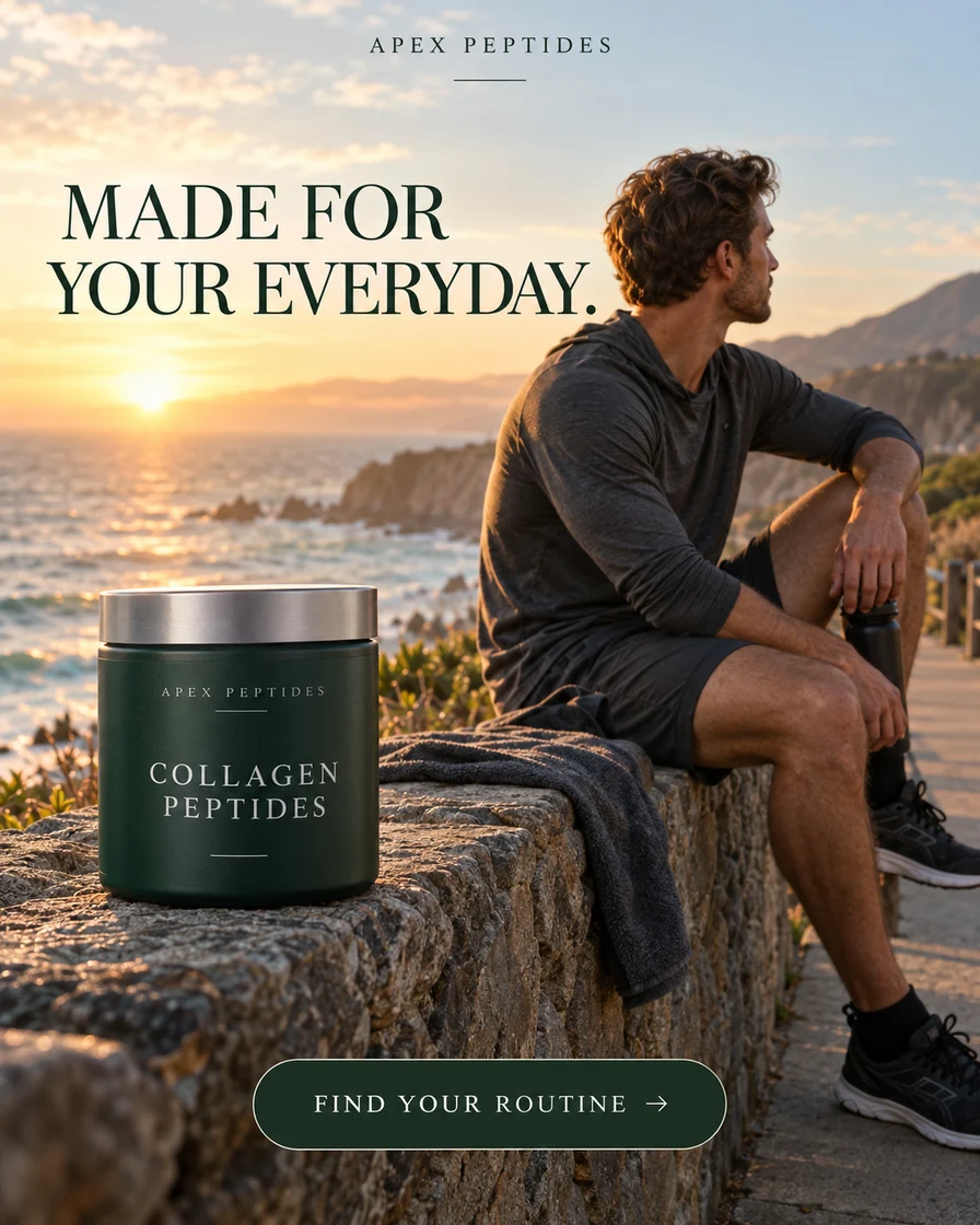
NutritionConcept 10
Collagen Peptides
Everyday fitness
Men · Outdoor routines
Read the creative brief +
Creative idea
An outdoor routine creates a different context from a gym ad. The creative connects nutrition with everyday habits without promising performance gains.
What to test
Compare outdoor and indoor settings before changing the headline or offer.
What to measure
Purchase conversion after a landing-page visit
Format
4:5 static concept · English
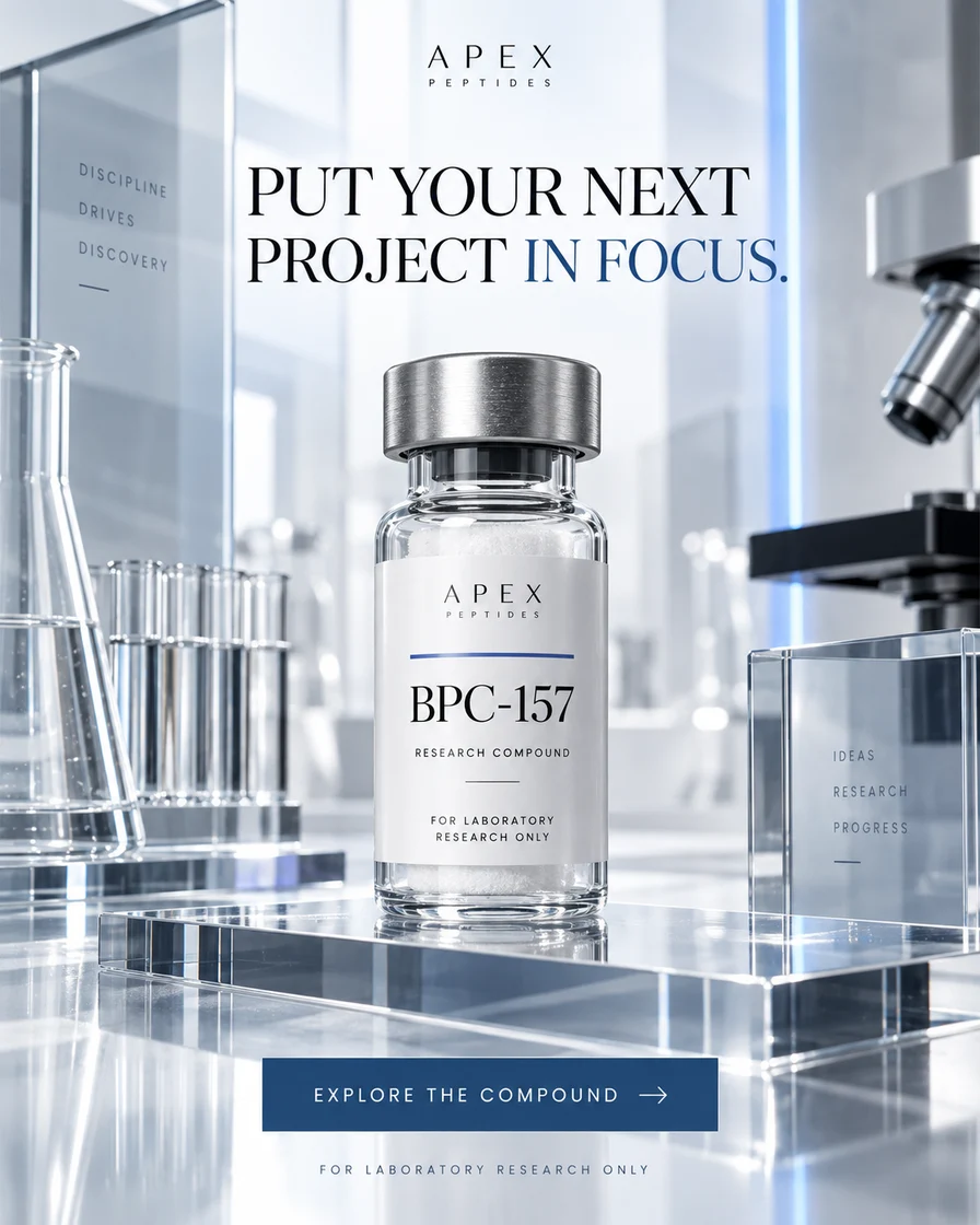
ResearchConcept 11
BPC-157
Project focus
Research project planners
Read the creative brief +
Creative idea
A focused research-project message narrows the creative to catalog exploration. Product presentation supplies the visual detail, rather than medical imagery.
What to test
Compare project-oriented copy with a straightforward product-name headline.
What to measure
Product-detail views per catalog session
Format
4:5 static concept · English
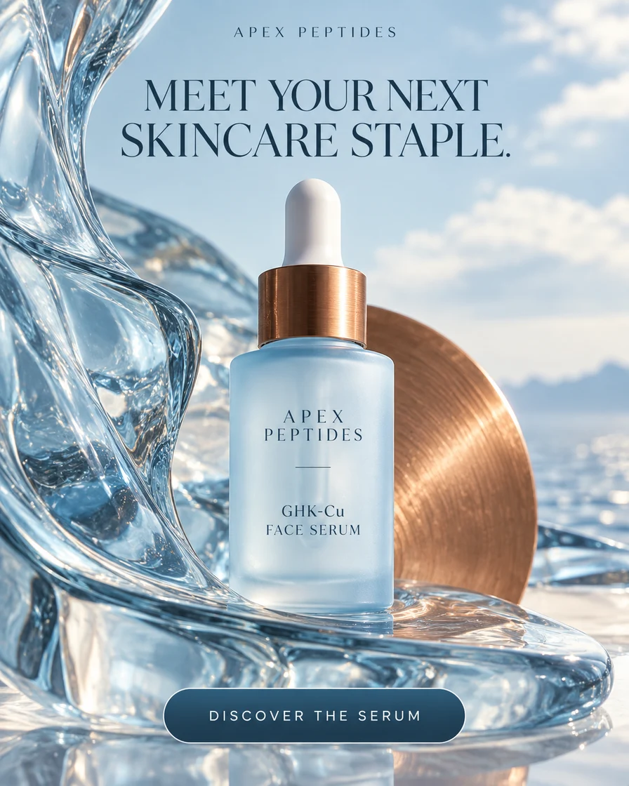
SkincareConcept 12
GHK-Cu
Ingredient spotlight
Ingredient-led beauty shoppers
Read the creative brief +
Creative idea
The bottle and ingredient name lead the composition. This gives ingredient-aware skincare shoppers a different entry point from a person-led routine ad.
What to test
Compare ingredient discovery with a daily-ritual message using the same serum and offer.
What to measure
Product-page conversion rate
Format
4:5 static concept · English
SkincareConcept 13
GHK-Cu
Replenishment
Returning skincare shoppers
Read the creative brief +
Creative idea
A replenishment message builds on a familiar skincare routine. The composition keeps the same product identity while changing the reason to return.
What to test
Compare replenishment copy with a collection reminder for an eligible returning audience.
What to measure
Repeat-purchase rate and cost per purchase
Format
4:5 static concept · English
NutritionConcept 14
Collagen Peptides
Habit building
Returning fitness shoppers
Read the creative brief +
Creative idea
Habit-building copy provides a second conversation with someone who knows the product. The training context remains familiar instead of introducing a new promise.
What to test
Compare a habit reminder with a direct product reminder, using the same offer.
What to measure
Returning-customer conversion
Format
4:5 static concept · English
ResearchConcept 15
Retatrutide
Reactivation
Returning catalog customers
Read the creative brief +
Creative idea
Gold tones and a familiar-compound headline make this a visual refresh of an existing catalog item. Familiarity is the message; efficacy is not implied.
What to test
Compare a refreshed visual with the original catalog asset while retaining the same headline.
What to measure
Engaged return visits
Format
4:5 static concept · English
ResearchConcept 16
BPC-157
Repeat purchase
Repeat catalog customers
Read the creative brief +
Creative idea
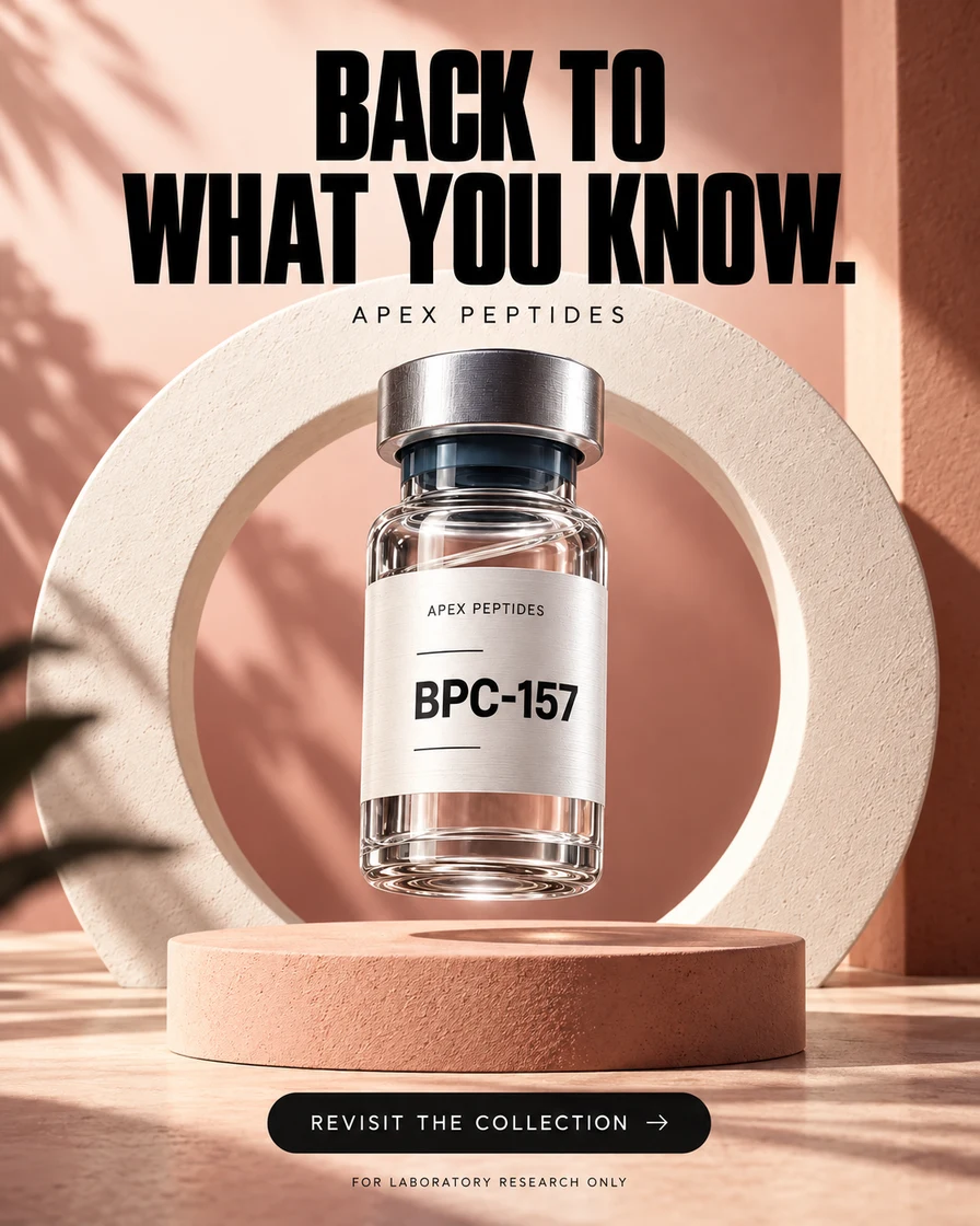
A simple return-to-the-collection message keeps the next action clear. Warm architectural shapes offer a softer alternative to technical product staging.
What to test
Compare warm and cool backgrounds with the same returning-visitor message.
What to measure
Collection revisit rate
Format
4:5 static concept · English
ResearchConcept 17
GHK-Cu
Catalog discovery
Research catalog explorers
Read the creative brief +
Creative idea
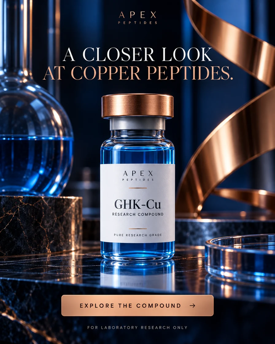
Copper and glass make the compound name visually memorable. The ad direction focuses on catalog exploration without borrowing claims from cosmetic formulations.
What to test
Compare a material-led close-up with a straightforward catalog packshot.
What to measure
Qualified product-detail visits
Format
4:5 static concept · English
ResearchConcept 18
Retatrutide
Research planning
New project planners
Read the creative brief +
Creative idea
A restrained palette puts the label and planning message first. It offers a quieter alternative to bright molecular imagery for the same catalog item.
What to test
Compare monochrome and saturated art direction with identical copy and placement.
What to measure
Catalog engagement after the click
Format
4:5 static concept · English
NutritionConcept 19
Collagen Peptides
Daily ritual
Everyday nutrition shoppers
Read the creative brief +
Creative idea
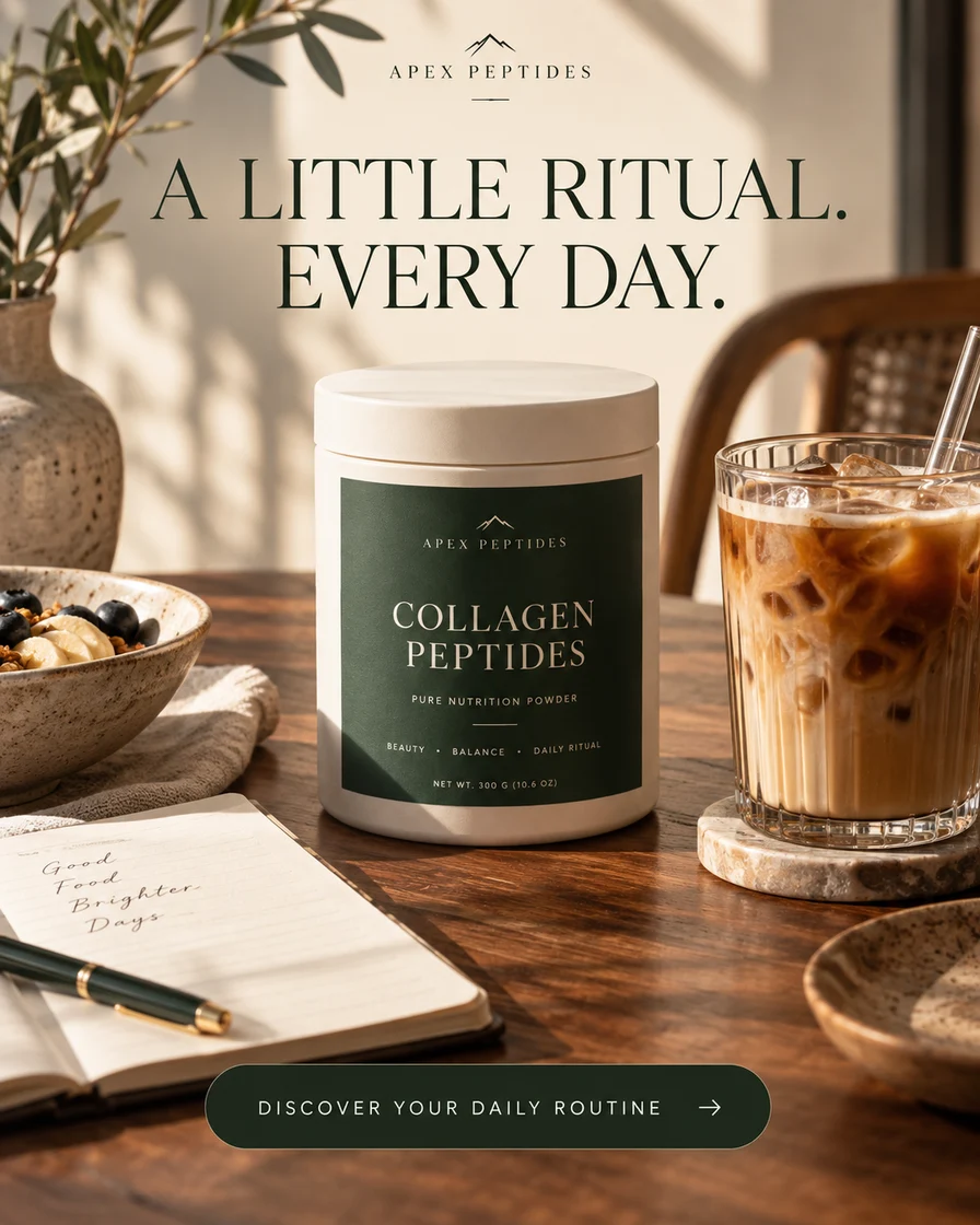
An everyday ritual broadens the creative beyond fitness settings. The product remains a nutrition item within a familiar routine, not a transformation shortcut.
What to test
Compare a daily-routine headline with an ingredient-led headline on the same image.
What to measure
Purchase rate and average order value
Format
4:5 static concept · English
SkincareConcept 20
GHK-Cu
Routine on the go
Women · Travel & skincare
Read the creative brief +
Creative idea
A change of setting gives the skincare ritual a fresh visual context. The product travels with the story while its identity stays consistent.
What to test
Compare an at-home routine and an on-the-go routine without changing the product claim.
What to measure
Landing-page visits and purchases
Format
4:5 static concept · English
ResearchConcept 21
BPC-157
Back to research
Returning research customers
Read the creative brief +
Creative idea
A next-chapter headline opens a conversation with returning catalog visitors. The hook concerns research planning, with no treatment or consumer-use narrative.
What to test
Compare a planning-led return message with a neutral catalog reminder.
What to measure
Engaged returning sessions
Format
4:5 static concept · English
ResearchConcept 22
GHK-Cu
Compound spotlight
Copper-peptide catalog explorers
Read the creative brief +
Creative idea
Copper provides an immediate visual association with the compound name. The concept stays in a research-catalog context, distinct from a finished skincare product.
What to test
Compare a copper-led palette with a neutral background at the same product scale.
What to measure
Qualified catalog clicks
Format
4:5 static concept · English
ResearchConcept 23
TB-500
Catalog expansion
Research catalog shoppers
Read the creative brief +
Creative idea
The collection-oriented message gives visitors a reason to explore beyond one item. A clear product focal point keeps that invitation specific.
What to test
Compare a collection invitation with a single-product invitation linking to the appropriate page.
What to measure
Catalog depth and relevant enquiries
Format
4:5 static concept · English
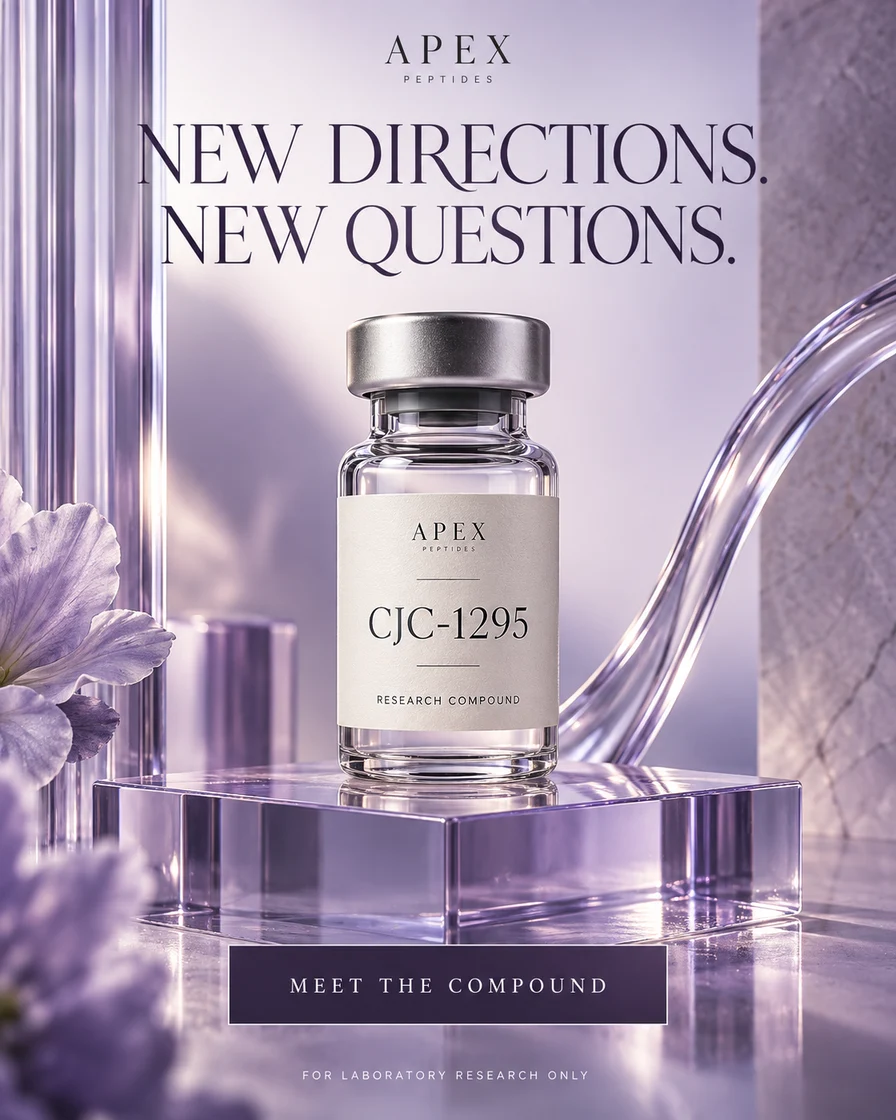
ResearchConcept 24
CJC-1295
New directions
Compound-aware researchers
Read the creative brief +
Creative idea
Violet separates this compound from the other catalog examples. A short research-direction headline leaves the label and composition room to communicate.
What to test
Compare colour-led differentiation with a consistent catalog-template approach.
What to measure
Product-detail engagement and relevant enquiries
Format
4:5 static concept · English
How to use the collection
Borrow the question. Write your own answer.
01
Start with the actual product
A finished cosmetic serum and a research compound can share an ingredient name but need different descriptions. Build the brief around what you actually sell, its evidence and the destination page.
02
Choose one buyer context
A new visitor needs an introduction. Someone comparing products needs a reason to choose. A returning shopper may need a reminder. Those are different messages, even when the product stays the same.
03
Make the test readable
Change the image, the hook or the offer deliberately. Keep the other variables steady where possible and record your hypothesis before spending. Otherwise you will not know what produced the difference.
What makes a useful example
The best peptide ad creative is the one you can learn from.
Polish earns attention, but attention is only one step. A useful creative makes the product category clear, gives the visitor a reason to continue and matches the page they reach. A striking visual with an unclear offer can still send the wrong traffic.
“High converting” should describe a measured result in a specific campaign. It is not a property we can assign to these concepts from appearance alone. Compare your own purchases, acquisition costs and business margins before calling a variation a winner.
Turn a creative observation into a measurable test
What you see
What to test
What to check after the click
A person-led routine
The same offer with a product-only image
Does the visitor understand and purchase the product?
An ingredient spotlight
An ingredient headline versus a routine headline
Do visits become product-detail engagement?
A returning-shopper message
A reminder versus a genuinely different offer
Do repeat orders justify the acquisition cost?
Before a concept becomes a campaign
Check the product, copy, audience, destination and placement together. A “research use” label, a different spelling or a disclaimer does not establish advertising eligibility. Use the Meta advertising guide for peptide businesses as a starting point, then check the current rules that apply to your offer.
Are these proven high-converting peptide ads?
No. They are original visual concepts with test hypotheses. We have not attached invented ROAS, sales figures or customer results. Performance has to be measured in the campaign where the ad runs.
Can the same angle work for different products?
A broad context such as a daily routine can inspire several briefs. The product description, imagery, evidence and destination still need to match the actual item. Do not carry a cosmetic claim into a research-compound ad.
Why are the examples in 4:5?
This collection uses a consistent 4:5 static canvas so you can compare the creative directions. A live campaign may need other sizes. Preview each placement and check that text and product details remain visible after framing.
How do I choose what to test first?
Choose the biggest unanswered question in your offer: product clarity, buyer context or reason to return. Select two concepts that answer that one question differently, then define the business result you will compare.